
THE CHALLENGE
Staffing companies often rely on traditional corporate branding that can feel generic or outdated. The challenge for Innovation Staffing Solutions was creating a visual identity that would feel professional while also representing the company’s modern approach to recruitment and workforce development.
The branding needed to communicate connection, growth, and global reach while remaining simple enough to be used consistently across multiple applications such as websites, marketing materials, and corporate documents. Another important consideration was ensuring the logo would remain clear and recognizable when used at different sizes or in different formats, from large marketing graphics to small digital icons.
THE SOLUTION
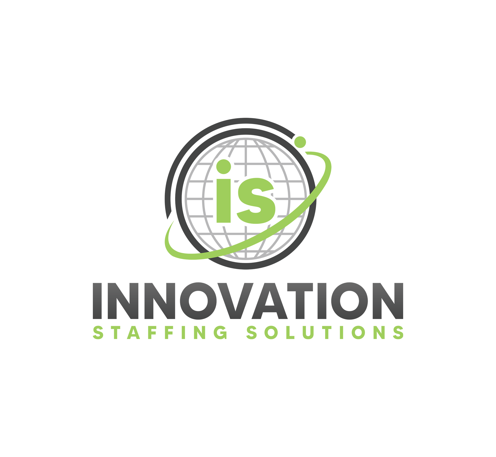
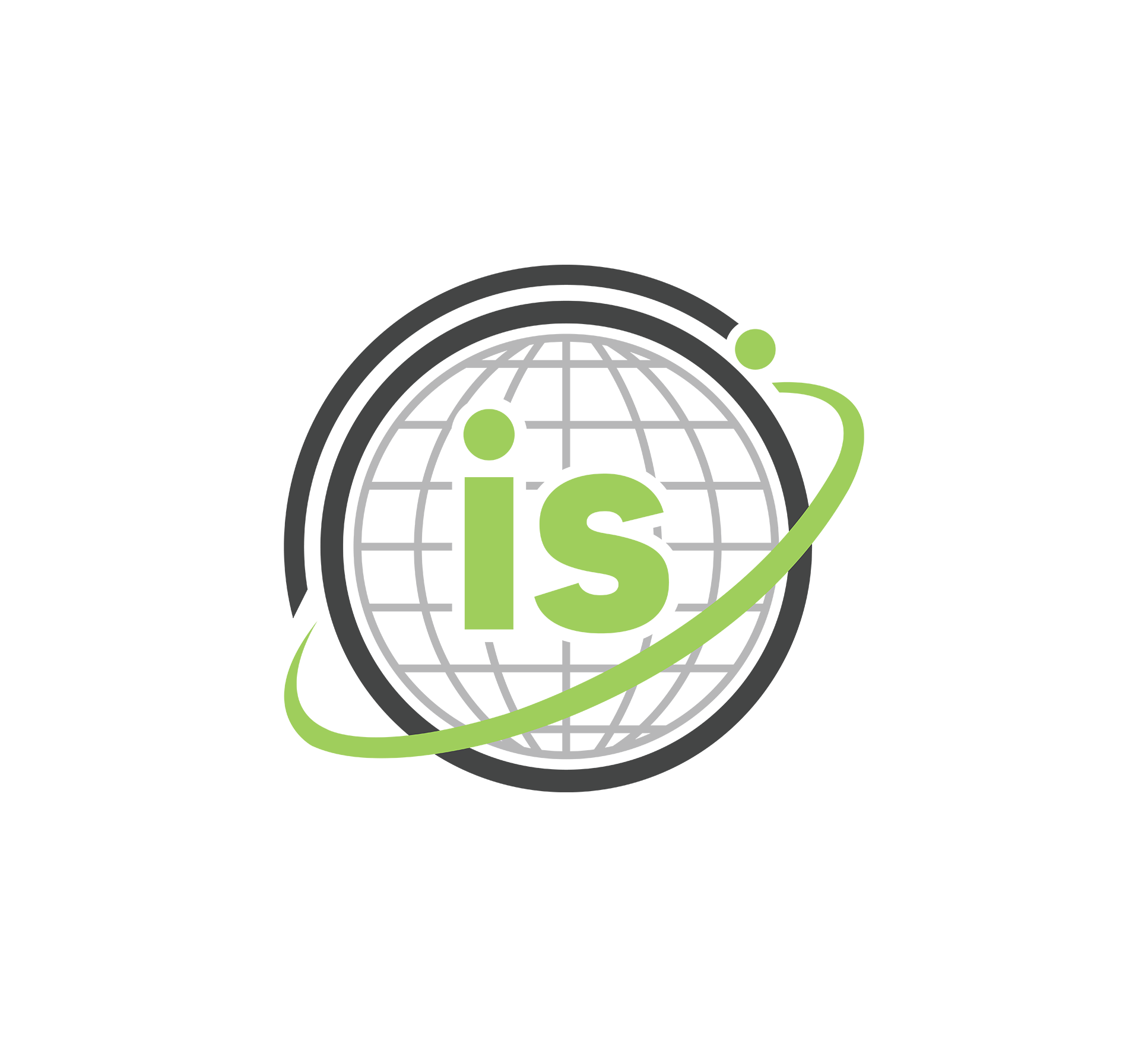
The identity was built around a symbol that combines the company initials with a stylized globe. The globe represents global connectivity, opportunity, and the movement of talent across industries and markets. A dynamic orbit surrounding the symbol reinforces the idea of connection and continuous growth, reflecting how the company helps businesses and professionals move forward.
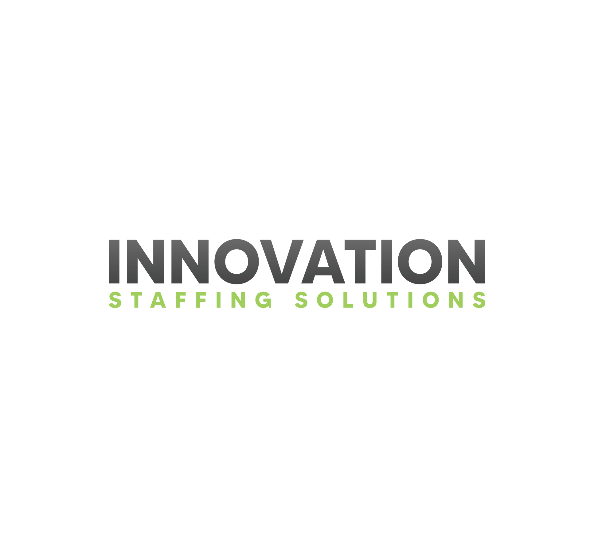
The typography was selected to be clean, modern, and highly legible. This ensures the brand remains professional while also feeling approachable. The overall logo composition balances the icon and the wordmark to create a structure that works effectively across both horizontal and compact layouts. This approach allowed the brand to communicate both innovation and stability, two qualities that are essential within the staffing industry.
FINAL VISUAL RESULT
The final brand identity provides Innovation Staffing Solutions with a strong and recognizable visual presence that reflects its mission of connecting businesses with talent. The combination of a symbolic icon, modern typography, and a balanced color palette creates a professional brand that can grow alongside the company. The identity system is flexible enough to work across a wide range of applications while maintaining a consistent appearance. This allows the company to present itself confidently across digital platforms, printed materials, and future marketing initiatives.