THE CHALLENGE
Trading card communities are highly visual and competitive environments where branding plays an important role in recognition. The challenge was creating a logo that would instantly capture attention within social media feeds, livestream thumbnails, and promotional posts.
The design also needed to communicate excitement and prestige, which are important elements in the world of card collecting and live breaks. At the same time, the logo needed to remain readable and impactful across different formats such as profile images, banners, merchandise, and promotional graphics.
THE SOLUTION
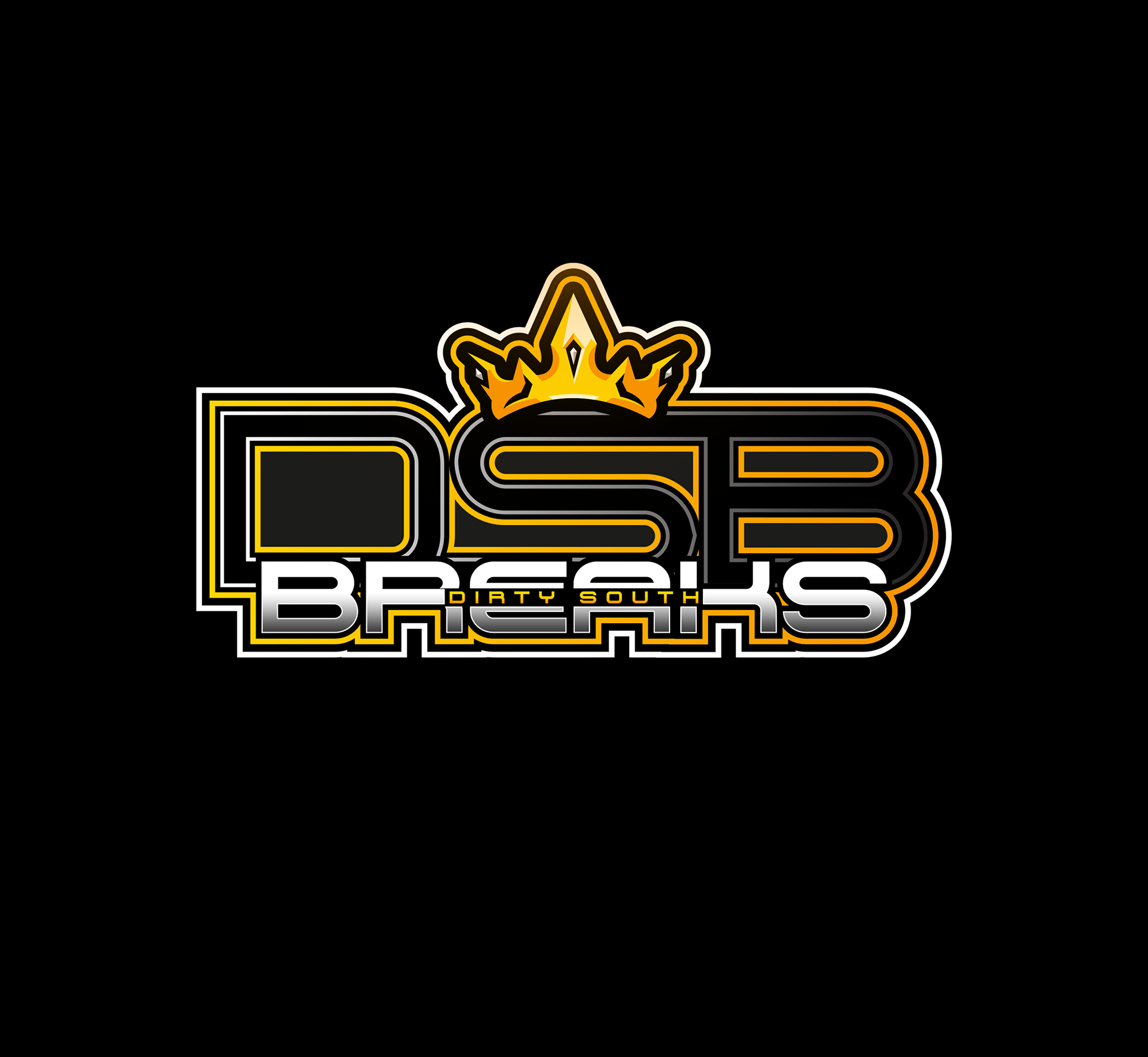
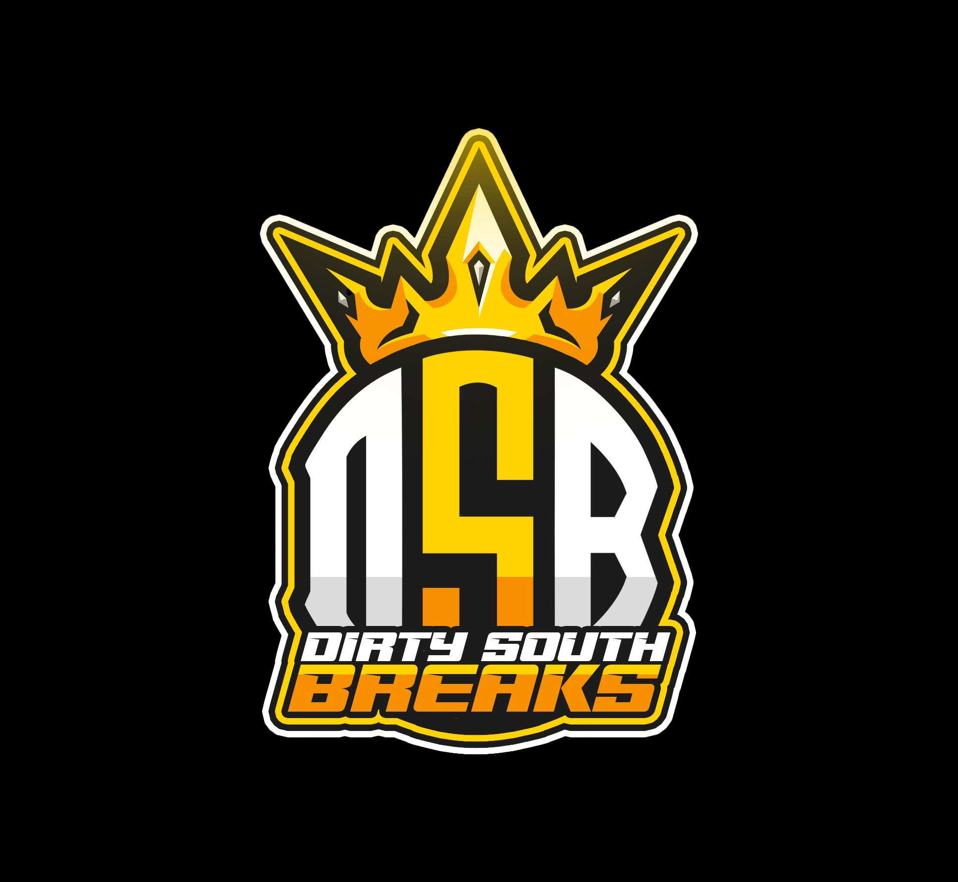
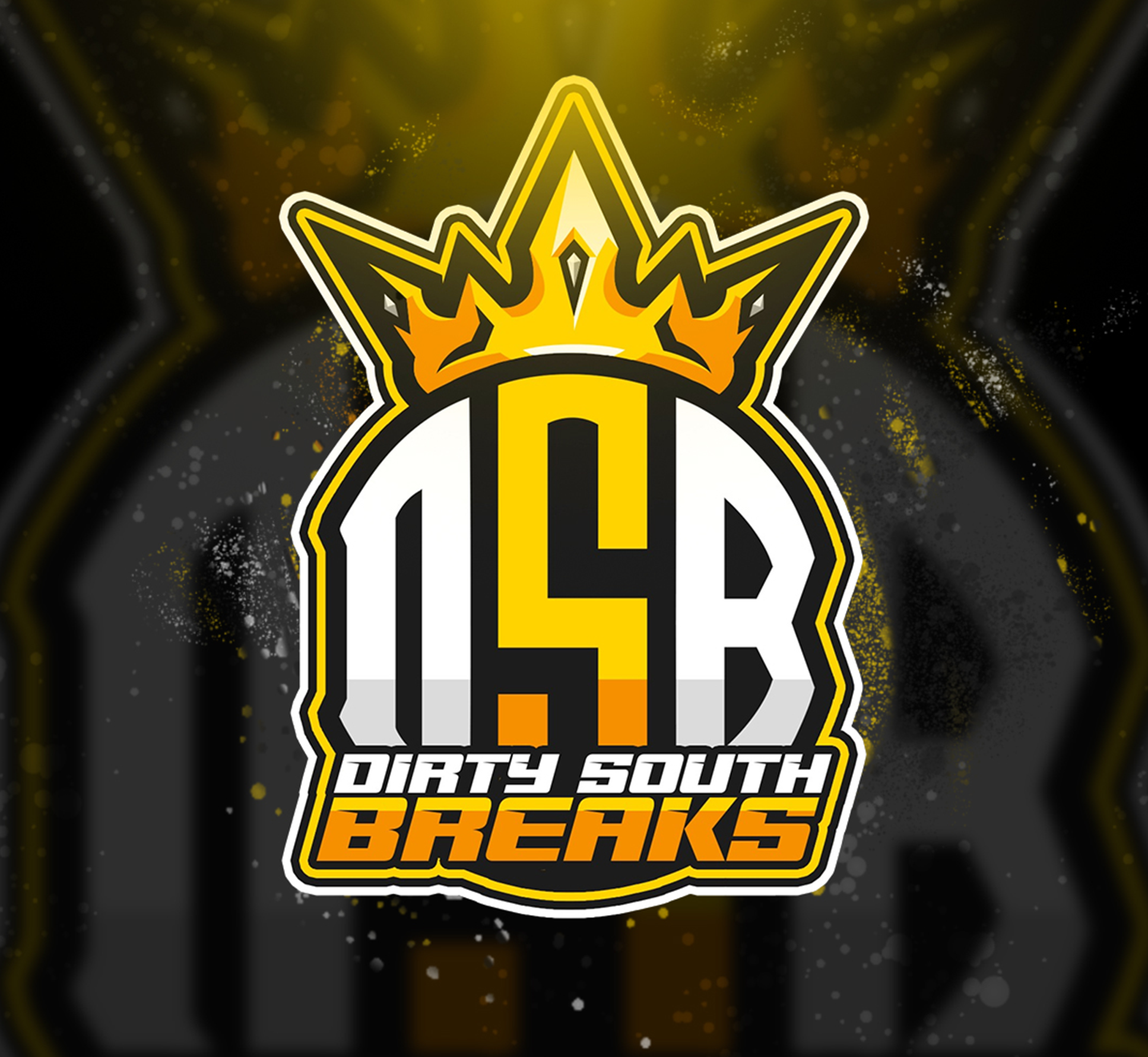
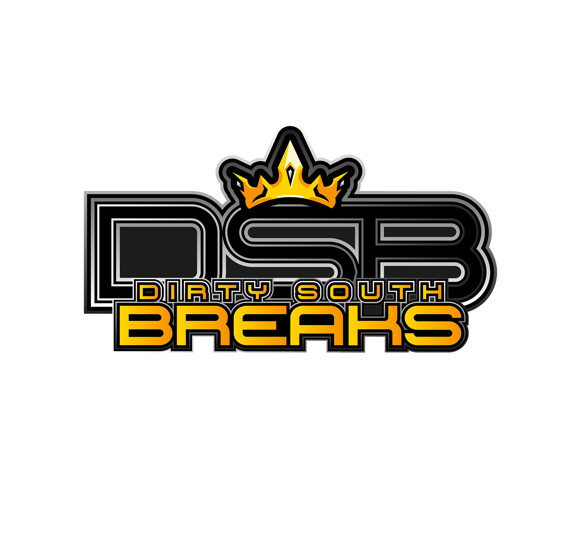
The final identity combines strong typography with a bold emblem to create a logo that feels energetic and competitive. The crown element reinforces the idea of winning, rarity, and high-value pulls that collectors often chase during card breaks.
The large DSB lettering provides strong recognition while allowing the logo to remain readable even when scaled down for social media icons or streaming overlays. The color palette uses black, gold, and metallic tones to evoke the premium and collectible nature of trading cards.
FINAL VISUAL RESULT
The completed logo gives Dirty South Breaks a strong visual identity that stands out within the trading card community. The design captures the competitive energy of collecting while maintaining a clean and structured layout that works across digital platforms. The identity is flexible enough to be used across social media groups, livestream branding, promotional graphics, and merchandise while remaining immediately recognizable to members of the community.