THE CHALLENGE
Trucking companies rely heavily on visibility and brand recognition. Unlike many other businesses, their brand is often displayed on large moving vehicles traveling across highways and cities. The challenge was to design a logo that would remain clear, bold, and recognizable even when viewed from a distance or at high speeds.
The branding also needed to communicate strength and structure while aligning with the industrial nature of the logistics industry. At the same time, the identity had to maintain a modern and professional look that could scale across different applications including truck graphics, documentation, uniforms, and digital presence.
THE SOLUTION
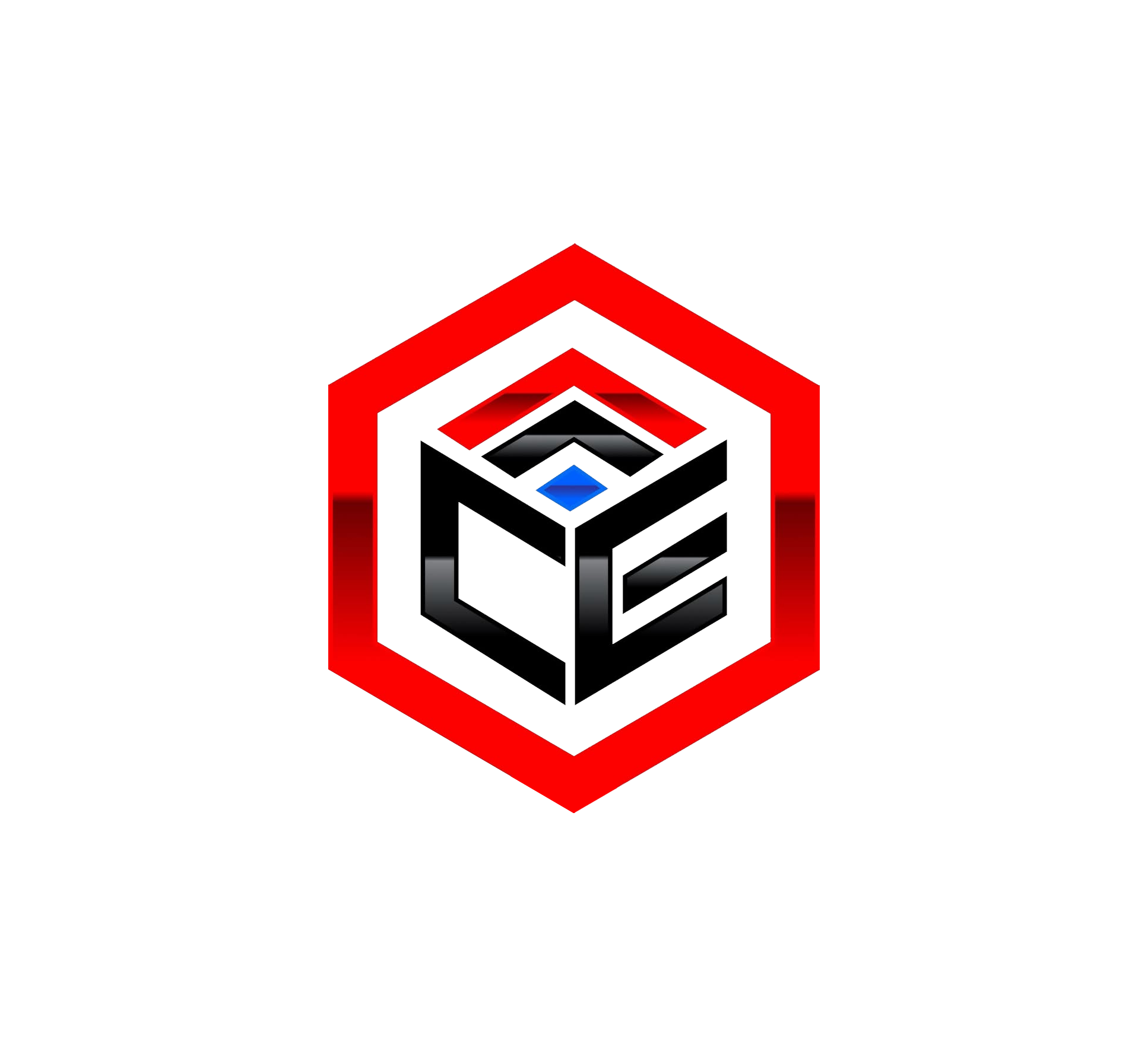
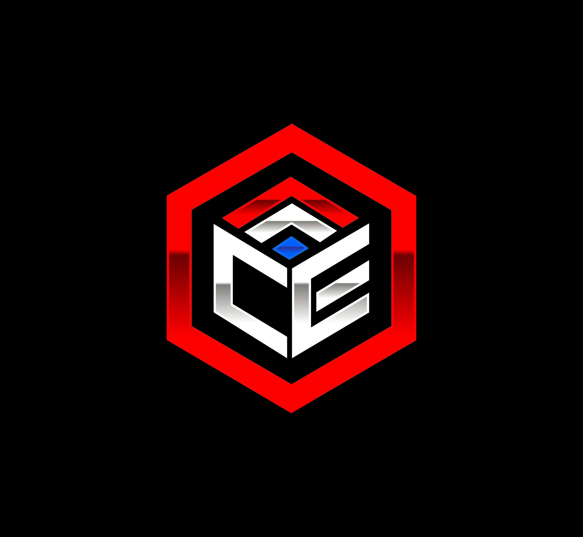
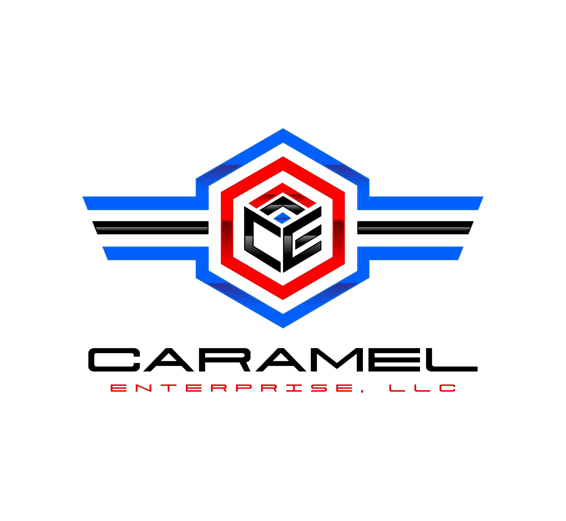
The identity was built around a strong geometric symbol that incorporates the initials of the company into a structured emblem. The hexagonal shape reflects strength and structure, while the layered design suggests movement and direction, qualities that are essential within the transportation and logistics industry.
The color palette uses bold red and blue tones combined with black and white elements to create high contrast and strong visibility. These colors help the brand remain noticeable on the road while maintaining a professional appearance. The typography was selected to be modern and industrial, reinforcing the company’s presence as a reliable transportation provider.
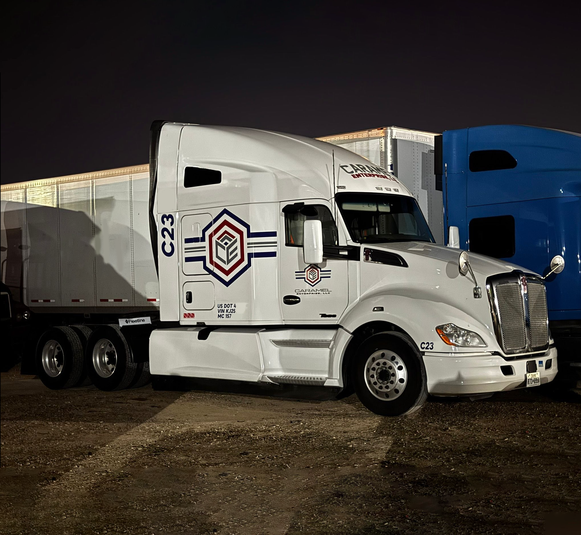
FINAL VISUAL RESULT
The completed brand identity gives Caramel Enterprise a powerful visual presence that reflects the strength and reliability required in the trucking industry. When applied to the company’s trucks and trailers, the logo becomes a strong visual marker that helps the brand stand out on the road. The combination of bold geometry, strong typography, and high-contrast colors creates a recognizable identity that supports the company’s professional image while turning its fleet into a moving representation of the brand.