THE CHALLENGE
Automotive service brands often compete heavily on visual appeal. Customers in this industry tend to associate brand quality with how polished and professional the business appears. The challenge was creating a logo that captured the energy of automotive culture while still representing precision and high-end detailing services.
Another key consideration was ensuring the identity would remain impactful across multiple uses, including social media graphics, shop signage, apparel, and promotional materials. The brand also needed to resonate with car enthusiasts while communicating trust and professionalism to everyday customers seeking vehicle protection and upgrades.
THE SOLUTION
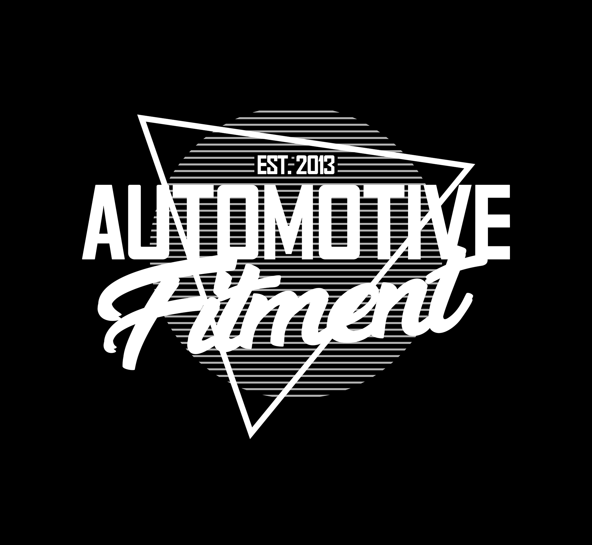
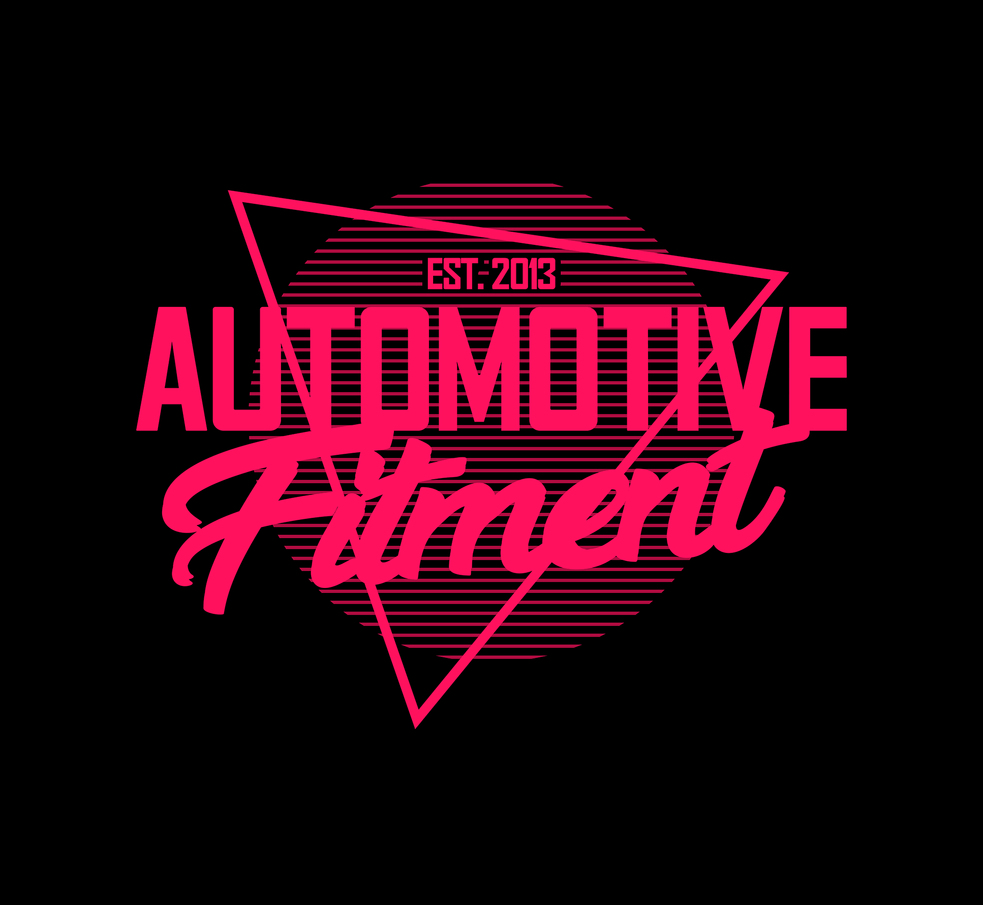
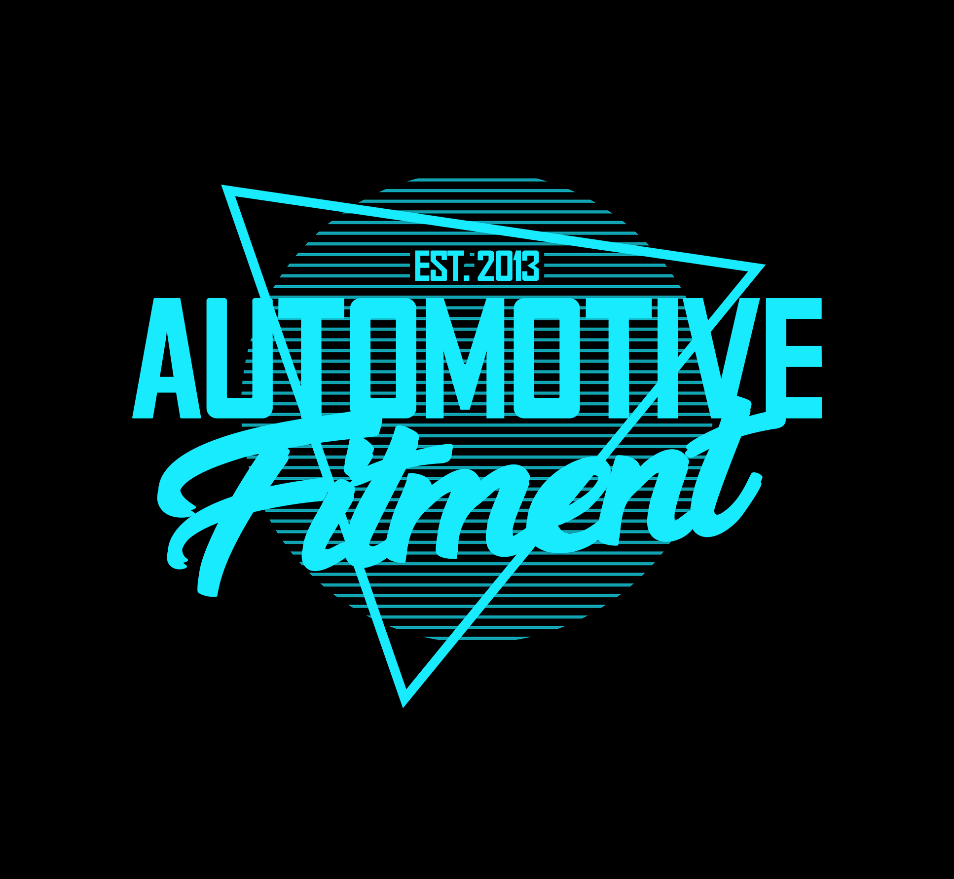
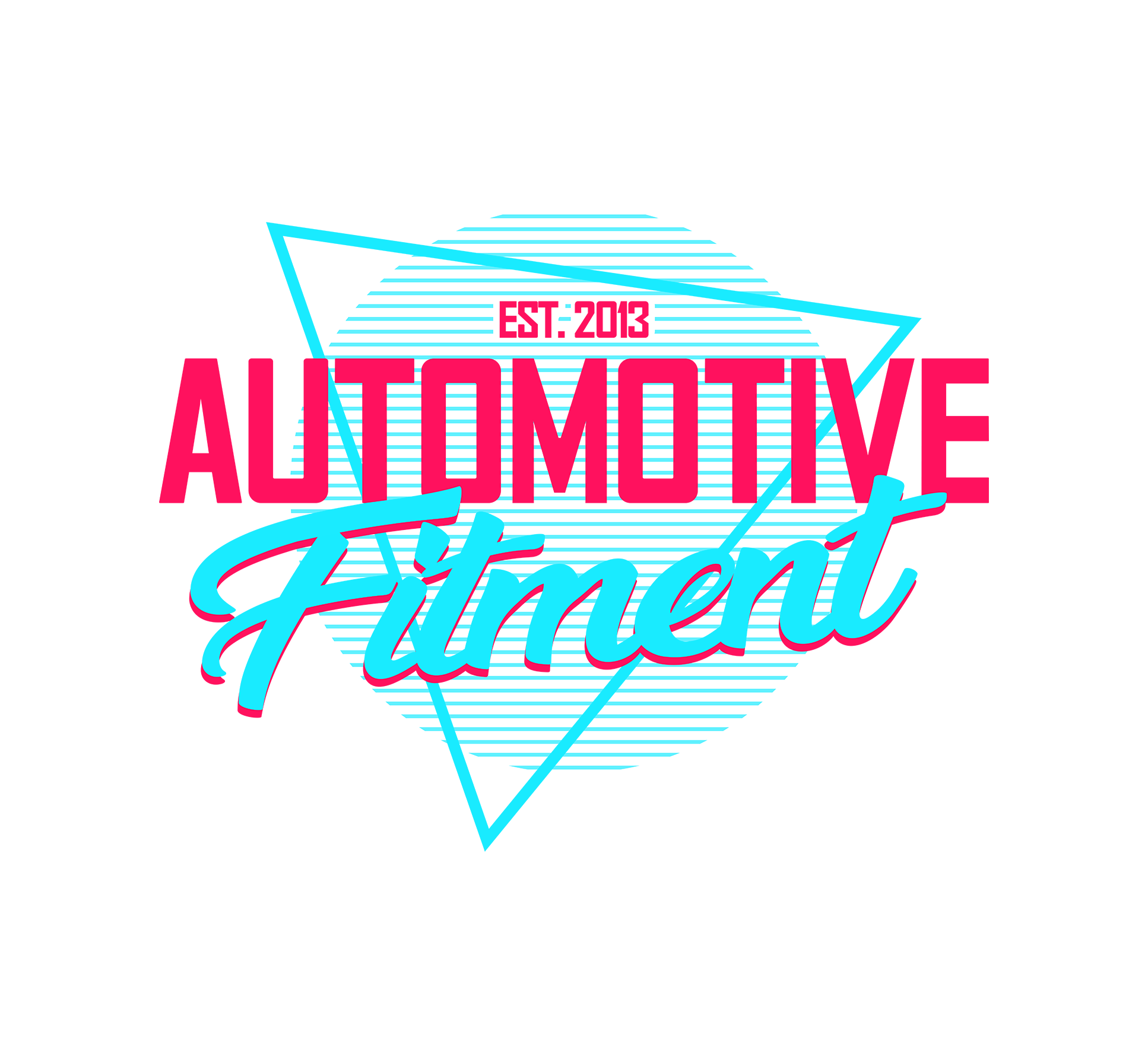
The final identity combines bold typography with retro-inspired graphic elements that reflect the vibrant aesthetic of automotive culture. The neon-style color palette uses strong pink and teal tones to create contrast and visual impact while referencing classic performance and street culture visuals.
Geometric shapes and layered line patterns add depth and movement to the logo, reinforcing the idea of speed, motion, and precision. The typography balances bold uppercase lettering with a script-style element, creating a dynamic visual hierarchy that keeps the brand energetic and memorable.
FINAL VISUAL RESULT
The completed logo provides Automotive Fitment with a strong and recognizable visual identity that reflects the performance-driven and detail-oriented nature of the business. The vibrant color palette and bold lettering give the brand a distinctive personality that appeals to automotive enthusiasts while maintaining professional credibility. The design works effectively across digital platforms, marketing materials, and physical branding elements, helping the business establish a memorable presence within the automotive customization community.